
A lean diagnostic tool designed to reveal where digital systems, dashboards, automation, data collection and workflows are adding effort without adding value.
1. Purpose of the tool
The tool helps teams answer five questions:
- Where is digital activity happening?
- Does it add value to the customer, the process, compliance, or decision-making?
- What kind of waste is it creating?
- How severe is that waste?
- How can we visualise it clearly enough to act on it?
2. Core idea
Traditional lean looks for waste in physical processes.
This tool applies the same thinking to digital environments.
It identifies waste such as:
- duplicate data entry
- unnecessary approvals in systems
- too many dashboards
- unused reports
- alerts nobody acts on
- manual work caused by poor system integration
- overcomplicated workflows
- collecting data that is never used
- digital rework due to poor data quality
- waiting caused by system delays
- automation of broken processes
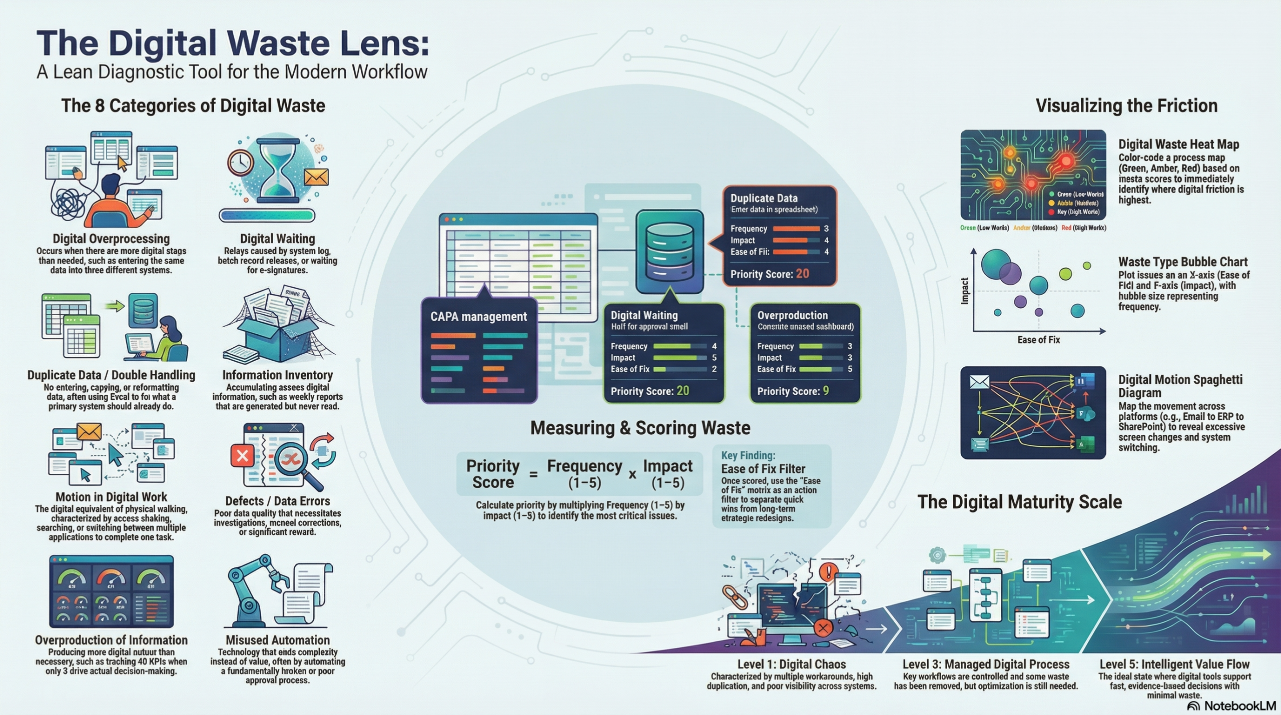
3. The 8 categories of digital waste
You can adapt these, but this is a strong starting model.
| Digital Waste Category | Description | Typical Example |
|---|---|---|
| 1. Digital Overprocessing | More digital steps than needed | Entering the same data into 3 systems |
| 2. Digital Waiting | Delays caused by systems, approvals, or access | Waiting for e-signatures or batch record release |
| 3. Duplicate Data / Double Handling | Re-entering, copying, exporting and reformatting data | Excel used to fix what the main system should do |
| 4. Information Inventory | Excess digital information stored but not used | Reports generated weekly and never read |
| 5. Motion in Digital Work | Excess clicking, searching, switching systems | Staff opening 6 applications to complete one task |
| 6. Defects / Data Errors | Poor data quality causing correction or rework | Wrong master data creating investigation work |
| 7. Overproduction of Information | Producing more reports, alerts, dashboards than needed | 40 KPIs when only 5 drive decisions |
| 8. Misused Automation / Misaligned Technology | Technology adds complexity instead of value | Workflow automation on a poor approval process |
4. The assessment sheet
Each activity in a process is reviewed using the following fields.
Digital Waste Assessment Template
| Step No. | Process Step | Digital Tool/System Used | User Action | Value Added? (Y/N) | Waste Type | Description of Waste | Frequency | Impact | Ease of Fix | Score |
|---|
Scoring method
Use a simple 1–5 scale:
- Frequency: How often does this happen?
- Impact: How much time, frustration, risk, or cost does it create?
- Ease of Fix: How easy is it to remove or reduce?
A simple priority score can be:
Priority Score = Frequency × Impact
Then use Ease of Fix as an action filter.
Example:
| Process Step | Waste Type | Frequency | Impact | Ease of Fix | Score |
|---|---|---|---|---|---|
| Enter batch data in second spreadsheet | Duplicate Data | 5 | 4 | 4 | 20 |
| Wait for manual approval email | Digital Waiting | 4 | 5 | 2 | 20 |
| Generate unused weekly dashboard | Overproduction of Information | 3 | 3 | 5 | 9 |
5. Visualisation method
The best way to visualise digital waste is to combine process mapping with waste scoring.
A. Digital Waste Heat Map
Create a process map and colour each step based on waste score:
- Green = low waste
- Amber = moderate waste
- Red = high waste
This immediately shows where digital friction is concentrated.
Example:
Receive Order → Enter ERP → Export to Excel → Re-enter to QA tracker → Email Approval → Update Dashboard
    Green          Amber         Red              Red               Amber          Amber
B. Waste Type Bubble Chart
Plot each issue by:
- X-axis = Ease of Fix
- Y-axis = Impact
- Bubble size = Frequency
This helps identify quick wins and major redesign priorities.
C. Digital Waste Pareto
Count how many waste findings fall into each category.
Example:
- Duplicate data entry – 12 findings
- Waiting for approvals – 9 findings
- Unused reporting – 7 findings
- Data quality defects – 5 findings
This helps focus improvement on the biggest themes.
D. Spaghetti Diagram for Digital Motion
Instead of physical walking, map movement across systems:
- ERP
- MES
- Excel
- SharePoint
- QMS
- Teams
This reveals digital switching waste.
Example insight:
“One deviation investigation requires movement across 7 platforms and 14 screen changes.”
6. The diagnostic questions
For each process step, ask:
Value
- Does this digital step directly add value?
- Would the customer care if this step disappeared?
- Is it required for compliance, control, or safety?
Waste
- Is the same data entered more than once?
- Is this report actually used for decision-making?
- Is anyone waiting for the system, a file, an approval, or access?
- Is this alert acted on, ignored, or duplicated elsewhere?
- Is this automation solving a real problem, or just hiding one?
- Is this dashboard informing action, or just creating activity?
- Is the technology simplifying the process, or increasing effort?
Flow
- How many systems are touched in this step?
- How many clicks, screens, downloads, or handoffs are involved?
- Where do people leave the main system and work offline?
7. A simple workshop approach
Step 1: Select one process
For example:
- CAPA
- deviation management
- batch record review
- purchase order approval
- training records
- maintenance work orders
Step 2: Map the current digital workflow
Capture:
- systems used
- handoffs
- approvals
- reports
- duplicate records
- manual workarounds
Step 3: Identify waste at each step
Use the 8 digital waste categories.
Step 4: Score the waste
Assess frequency and impact.
Step 5: Visualise it
Use a heat map or Pareto.
Step 6: Prioritise actions
Separate into:
- quick wins
- process redesign
- system integration fixes
- reporting reduction
- automation redesign
8. Example
Process: CAPA management
| Step | Activity | Waste Found | Type | Score |
|---|---|---|---|---|
| 1 | CAPA raised in QMS | Same issue logged again in tracker | Duplicate Data | 20 |
| 2 | Manager approval | Waiting 3 days for email approval | Digital Waiting | 16 |
| 3 | Investigation record | Staff using Word offline then pasting in system | Overprocessing | 15 |
| 4 | KPI reporting | Data exported monthly to create PowerPoint no one uses | Overproduction | 12 |
| 5 | Closure | Errors in dropdown fields require rework | Defects | 10 |
Visual summary
- biggest waste theme: duplicate data entry
- biggest risk area: approval delays
- easiest win: remove unused PowerPoint reporting
- systemic issue: QMS process not designed around actual user workflow
9. Suggested output format
You could present the final output in a one-page dashboard with:
Digital Waste Dashboard
- Process assessed
- Number of waste points identified
- Total high-priority issues
- Top 3 waste categories
- Estimated time lost per week
- Quick wins
- Strategic fixes
Example:
Process: Batch review
Waste findings: 18
High priority issues: 6
Top waste categories: Duplicate data, waiting, over-reporting
Estimated lost time: 11 hours/week
Quick wins: Remove duplicate spreadsheet, reduce approvals, retire unused report
10. A name for the tool
Here are a few possible names:
- Digital Waste Lens
- Lean Digital Waste Scanner
- Digital Muda Map
- eWaste Flow Tool
- Digital Value vs Waste Matrix
- Smart Waste Diagnostic
- Digital Process Waste Radar
My preference is:
Digital Waste Lens
because it is simple, clear, and usable in workshops.
11. A maturity scale you can add
You could score each process from 1 to 5:
| Level | Description |
|---|---|
| 1 | Digital chaos – multiple workarounds, duplication, poor visibility |
| 2 | Basic digitisation – digital tools exist but waste remains high |
| 3 | Managed digital process – key workflows controlled, some waste removed |
| 4 | Lean digital flow – streamlined systems, useful reporting, low duplication |
| 5 | Intelligent value flow – digital supports fast, evidence-based decisions |
12. Key principle behind the tool
A strong statement to place at the top of it:
Not all digital activity is value.
If technology creates more effort, delay, confusion, or rework, it is digital waste.
13. Simple visual model
You could show the logic like this:
Digital Step → Does it add value?
                 ↓
              If No
                 ↓
       Classify the waste type
                 ↓
          Score frequency/impact
                 ↓
            Visualise on map
                 ↓
         Eliminate / simplify / automate properly
14. Best use cases
This tool would work very well in:
- pharma
- medical device
- food manufacturing
- quality systems
- CAPA
- deviation management
- training systems
- ERP / MES / QMS workflows
- reporting processes
- digital transformation reviews
15. Final definition
Here is a polished definition you could use:
Digital Waste Lens is a lean diagnostic tool used to identify, classify, score and visualise non-value-adding digital activity within a process. It helps organisations distinguish between useful digitisation and digital waste by highlighting duplication, delay, unnecessary reporting, poor system design, data rework and misaligned automation.